Internal preview · review only
3-tier product row.
Pattern 3 with truly transparent PNG cutouts and no card backgrounds. Products float directly on the white page background.
Choice / Priority / Premier
Three tiers, one row. Same layout we'd drop on the AC installation, AC replacement, and heat-pump service pages.
Notes on the photos
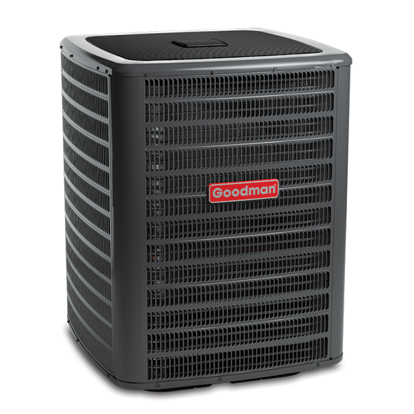
- Goodman GSX16 · 600x600 PNG, true transparent. Pulled from goodmanmfg.com. Production-ready.
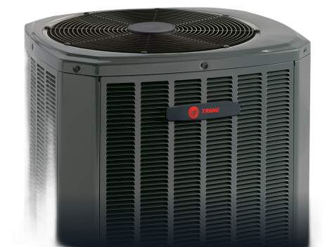
- Trane XR16 · 475x352 PNG, true transparent (background-removed). Source was a multi-model marketing image with a baked-in dark gradient; ran through `rembg` to clean. The unit shown is partial (top-down), so before going live we'd swap for a full-body Trane condenser cutout from the dealer portal.
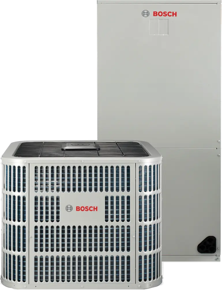
- Bosch IDS Premium · 770x1006 WebP, true transparent. Pulled from bosch-homecomfort.com. Note this image shows the condenser PLUS the indoor air handler stacked. For a clean condenser-only tier comparison we'd want to crop or source a condenser-only shot.
What I need from you
- Approve the row layout (centered, ~240px tall, no card background, equal vertical alignment).
- Approve the caption style (small green tier label + bold model name + thin spec line).
- Decide whether the Trane and Bosch photos are good enough as placeholders, or whether you want me to source replacements from the Trane and Bosch dealer portals before I scaffold this into the live service-page template.
- Tell me where this row should appear on a service page: above the symptoms section, below the scope, or as a standalone section between the FAQ and the reviews. My instinct is between scope and FAQ, where customers are deciding which tier they're buying.